

Re-design / Responsive Web Design
Rendezvous
Full-Length Case Study
Background
Rendezvous is a local hair & nail salon in Columbus, Ohio. The current website design is not conducive for new users looking to browse through what they offer & book appointments.
Research Goal
How can we redesign the Rendezvous website to retain all of the crucial information, while cleaning up the visual clutter, making it easier for users to navigate, eventually booking appointments.
Research Objectives & Methodologies
Easier navigation: Currently the Rendezvous website is rough, it is overwhelming to navigate, with each page containing mountainous walls of information, lack of attention to the “Book Online” section, which is arguably the most important job that a salon’s online website is supposed to carry out.
Enhance Accessibility: Font and color choices that randomly change through the pages, and make it a struggle to read and stay on track, and a lack of visual direction leading to a bland, uninteresting website.
Mobile Optimization: While both the Desktop and Mobile designs are in need of some touching up, the mobile is arguably worse, because they are working on a smaller screen, the egregious amount of information they display becomes a chore to read and scroll through.
Improve visual direction: Rendezvous takes pride in catering and helping people feel welcome and respected within their own identities, but yet they seem to lack a distinct visual design on their website. I’d like to try and help them design a more unique but functional visual design system that can make them stand out from the rest of the local salons.
5 Participants were interviewed
3 Participants that have been to Rendezvous in the past
2 Participants that have never been to Rendezvous
What did we learn?
User interviews gave us the following insights:
Out of the five participants, three of them are current or former Rendezvous hair salon patrons, the other two have not been to Rendezvous before, but instead go to a different local salon.
All of the participants have booked appointments online with their respective salon before, while also occasionally doing it over the phone when they are on the move.
When asked what is most important when they visit a salon’s website, all participants agreed that the booking function should be the primary feature of the website. This answer does change if they are first time visitors to the website or have never been to the salon before, in that case three of the five participants responded the same, they thought that it would be best to be easily able to see what services they offer, the prices of said services, and then be able to take a look at the staff and which services they can perform.
Three of the participants all expressed that they do not really enjoy trying new things regarding their hair, they like to keep the same hairdresser, style, experience, etc.
Two out of the five participants explicitly stated that they do not enjoy having to click through menu after menu when trying to book appointments, they think it should take the most minimal amount of clicks / taps possible.
How might we improve upon Rendezvous current design language to better communicate who, and what Rendezvous is. While keeping their information hierarchy digestible and navigable.
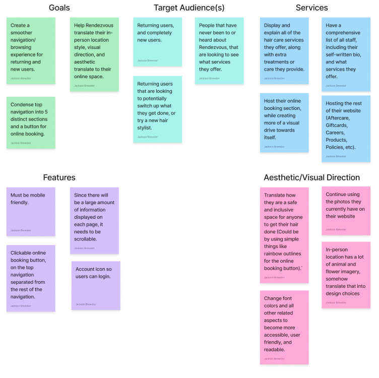
Project Goals & Feature Set
Business Goals:
Make sure the online appointment
booking process is the main focus
of the website, driving more traction
and revenue to the business
and hair dressers.Create a more organized browsing
experience so that users can easily
find the information they are looking for,
and so that important information that
is similar, is grouped together.Develop or apply a more unique visual
style, so that Rendezvous website
can stand out from the average salon
website, also reinforcing that
Rendezvous is a safe space for all, that
are trying to discover themselves, or become
more comfortable in their own skin.Retain previous customers, obtain new
customers.
User Goals:
Be able to navigate the site easily
and efficientlyBe able to start and finish the booking
process in a relatively quick manner.Be able to create an account, and login
so that previous appointments can be
saved and re-booked in an instant.Be able to browse reviews for the salon, and
sort by certain parameters.Be able to view categories of
information/services that are related,
or are grouped together by some kind of metric.

Initial Planning


User Testing - How do participants feel about this concept, and the initial designs?
5 Participants were interviewed.
Four of the five participants said that when they’re looking for a new hair stylist or salon, they specifically look for good & bad recent reviews, because while old reviews can matter, they really only care about how they have been performing recently.
Two participants expressed similar concerns about being overwhelmed when they were on the landing page of Rendezvous website. The sheer amount of tabs on the top navigation bar made them unsure of what they wanted to click on or where they wanted to go.


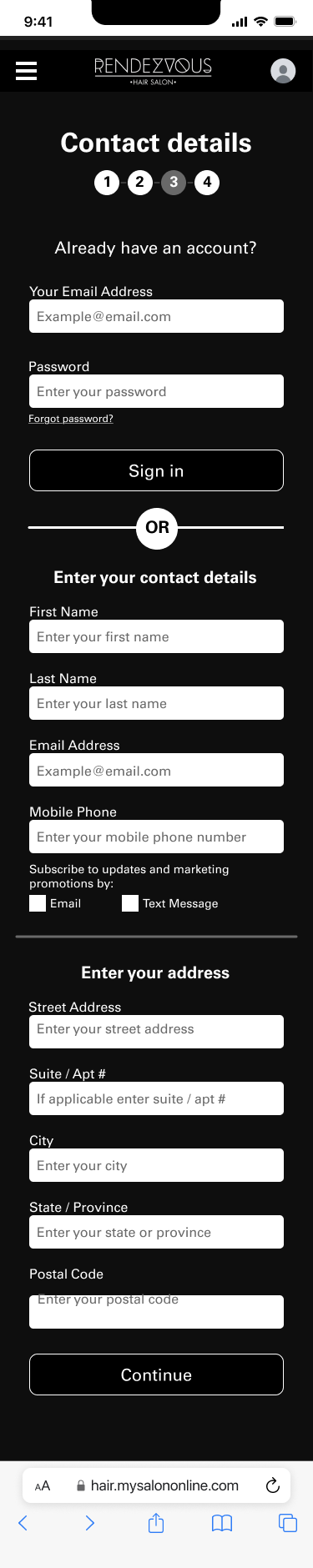
First round High-Fidelity Wireframes


Usability testing - How can we positively iterate upon these wireframes?
5 Participants were interviewed and had access to the wireframes, producing the following results.
All 5 participants completed every single task, with varying times due to exploration & familiarization.
The two participants that completed in under two minutes, are the ones that most frequently book online hair appointments, so they are accustomed to racing through the steps and just inputting their information as fast as they can. The four participants that finished around four minutes ended up this way because they took their time at each step, and read through what the input field was, and the information they should be inputting. These participants also read through the cancellation policy at the bottom of the last screen, which accounts for some of their time.
Participants liked the brief description for every staff member, but wished they were able to read more if someone caught their eye. They also wished that there was a way to view each staff member's contact information, and what services they offer specifically.
Next steps:
Take appropriate steps based on user feedback, work on clarity, color contrast, expandable text (or more ways to let users dive deeper into text, like taking them to another page, etc).
Work on adjusting elements to fit the mobile size better.
Work on how to showcase what services they have, while still displaying the carousel of pictures, almost like detaching the text from the carousel, and having users be able to dive into either the meatier text driving section, or rather if they want to look at a gallery of photos they can do that.
Potentially add a contact button either on the bottom footer, or within the contact page, so that users have an easier way right in front of them, to get in contact with the business.

Final High-Fidelity Wireframes


Reflection:
After finishing this project and giving myself some time to think over it all, I came up with the following conclusion(s).
While I enjoyed the entire design and research project for this case study, it was a decent load to take on as one person, especially a beginner as myself.
Trying to redesign or reorganize a website like Rendezvous that never had a specifically defined visual design style / language, made for moments where I was forced to make decisions out of my own creative liberty.
A crucial lesson I learned within this case study is that you should never be afraid to use libraries, assets, and features that are uploaded publicly. While it can feel like a short and lazy work around, they are so incredibly helpful because they are already proven to work, designed with thought and intent behind them, and have a distinct style. Trying to create every aspect of the appointment booking process was overwhelming, as I was designing aspects and elements that I had never touched before.